EGGUP
EGGUP
EGGUP
EGGUP
EGGUP
EGGUP

Overview
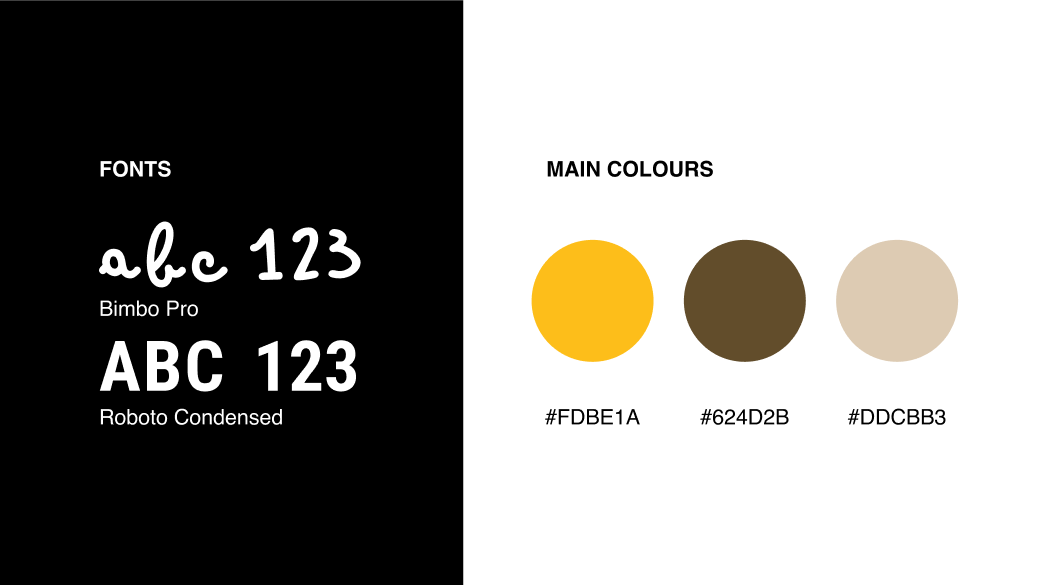
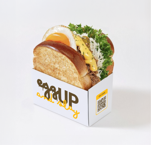
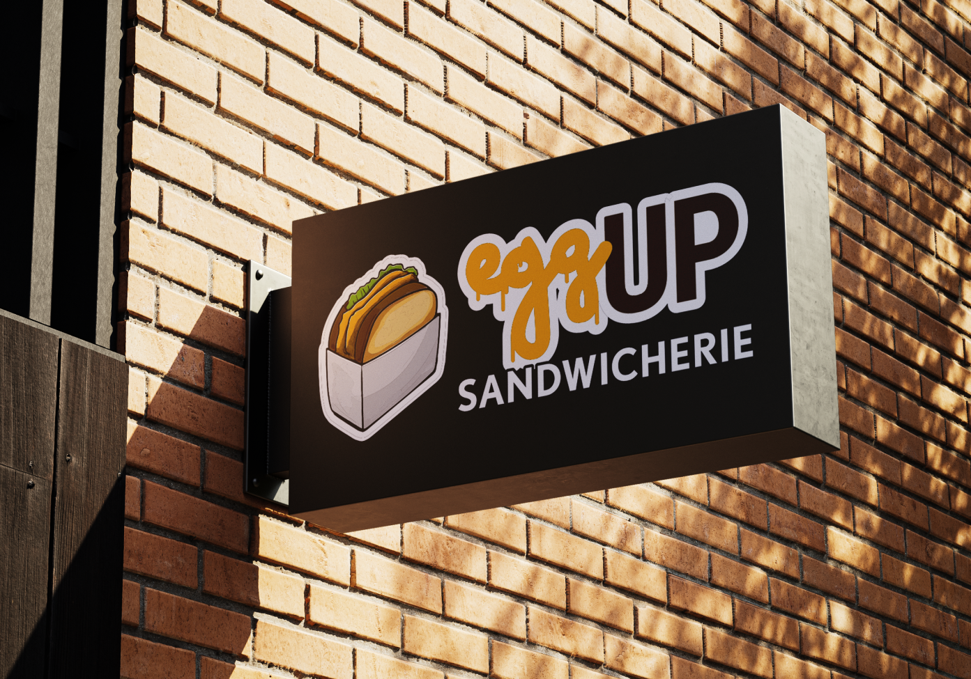
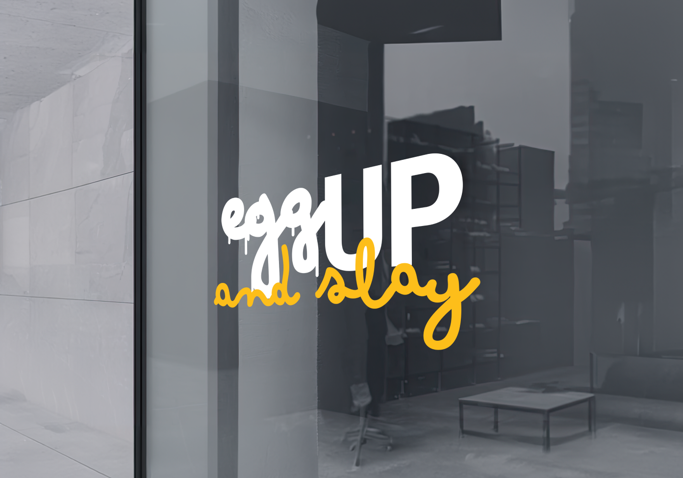
The branding concept for EGGUP merges urban culture, a passion for food, and the fast-paced lifestyle of city dwellers into a cohesive and vibrant identity. The logo features a stylized egg sandwich prominently displayed on an iconic sandwich tray that symbolizes both street food authenticity and modern convenience. The design uses bold, energetic colors—think electric yellows and fiery reds—to reflect the vibrant energy of the city and the zest of Korean street food. Custom typography with a sleek, contemporary edge reinforces the fast-paced vibe, while subtle urban elements, like graffiti-inspired accents or street art motifs, weave in the essence of city life. This concept is crafted to appeal to on-the-go customers who crave delicious, high-quality food without sacrificing style or speed.